Rochester, New York Jun 7, 2019 (Issuewire.com) - Web design in 2019 is taking a turn towards the unconventional, misshapen, fluid, and curious. Accelerate Media in Rochester NY explores the latest website design and digital marketing trends coming around the bend.
Internet marketing agencies and website design companies have long pursued the perfect symmetrical website: factory grade alignment. Front end developers typically want everything to line up neatly, proceed in an obvious pattern and be as straightforward as possible.
BREAKING THE GRID
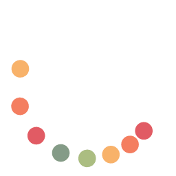
2019 will be the year of asymmetry and organic shapes. Websites with an asymmetrical design are also called broken grid sites. This means the traditional grid system, used by web developers to make sure everything aligns perfectly, is being abandoned in favor of disjointed layouts.
Why move away from the standard grid structure? Because there is a growing desire to look unique and reflect the imperfections and randomness of the real world. Companies and consumers are both looking for something different.
The last few years saw a huge movement towards clean, minimalist websites (also referred to as “flat design”). You know, the “less is more” school of thought. As a company, Apple led the charge for minimalist web design.
White space and conservative shapes have taken over the web design landscape. While the minimalist design is still very popular and will continue to be, we are now seeing a shift towards more dynamic elements such as:
- Crazy colors
- Distinctive shapes
- Overlapping card designs
- 3D illustrations
Fluidity Flows to the Forefront
Organic shapes and lines offer a sense of realness and approachability. They aren’t rigid and cold like sites that adhere to a strict grid design. Asymmetrical lines that mimic shapes from nature and life such as puddles, ponds, and lakes can feel more soothing and welcoming.
Overlapping design features also reflect life in the real world. Sometimes our space is infringed upon, sometimes we find ourselves a little too close to others, and sometimes it just feels like things are dropped right on top of us.
These intersecting facets of the human experience have made their way into digital design. Stacking multiple design elements can create a 3D effect that brings images to life and enhances the overall aesthetic of the site.
Experimentation is Cool Again
We haven’t seen the end of minimalist designs, but it is apparent that many designers are breaking out of their robotic shells and taking a more experimental approach than we’ve seen in recent years. Typography is getting wacky (in a good way). Navigation setups are receiving a makeover.
Header areas are being reimagined. Grids are being broken. Subheaders and text areas are shifting and offsetting. Content areas are moving and overlapping. Creativity is back in style, and every design element is fair game.
Learn more at:
https://www.acceleratemediainc.com
Media Contact
Accelerate Media matt@accelm.com 300 State Street https://www.acceleratemediainc.com


